Detroit Red Wings: It’s More Than Hockey
-
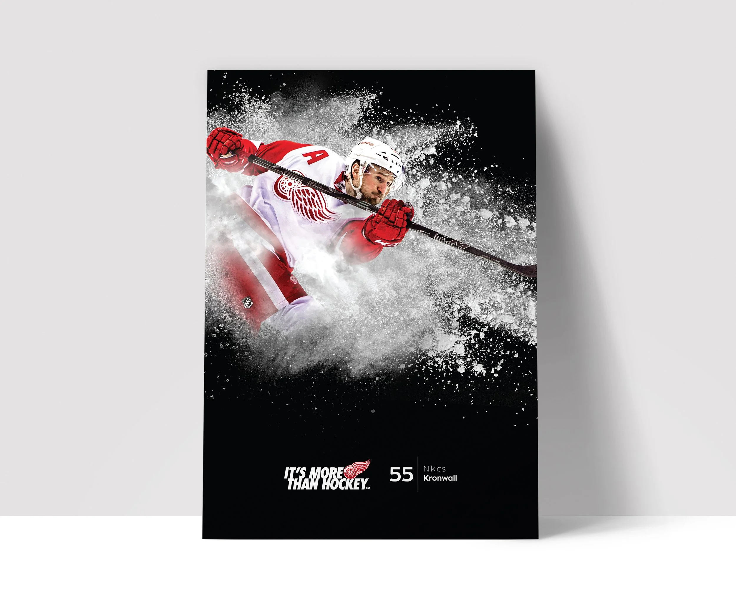
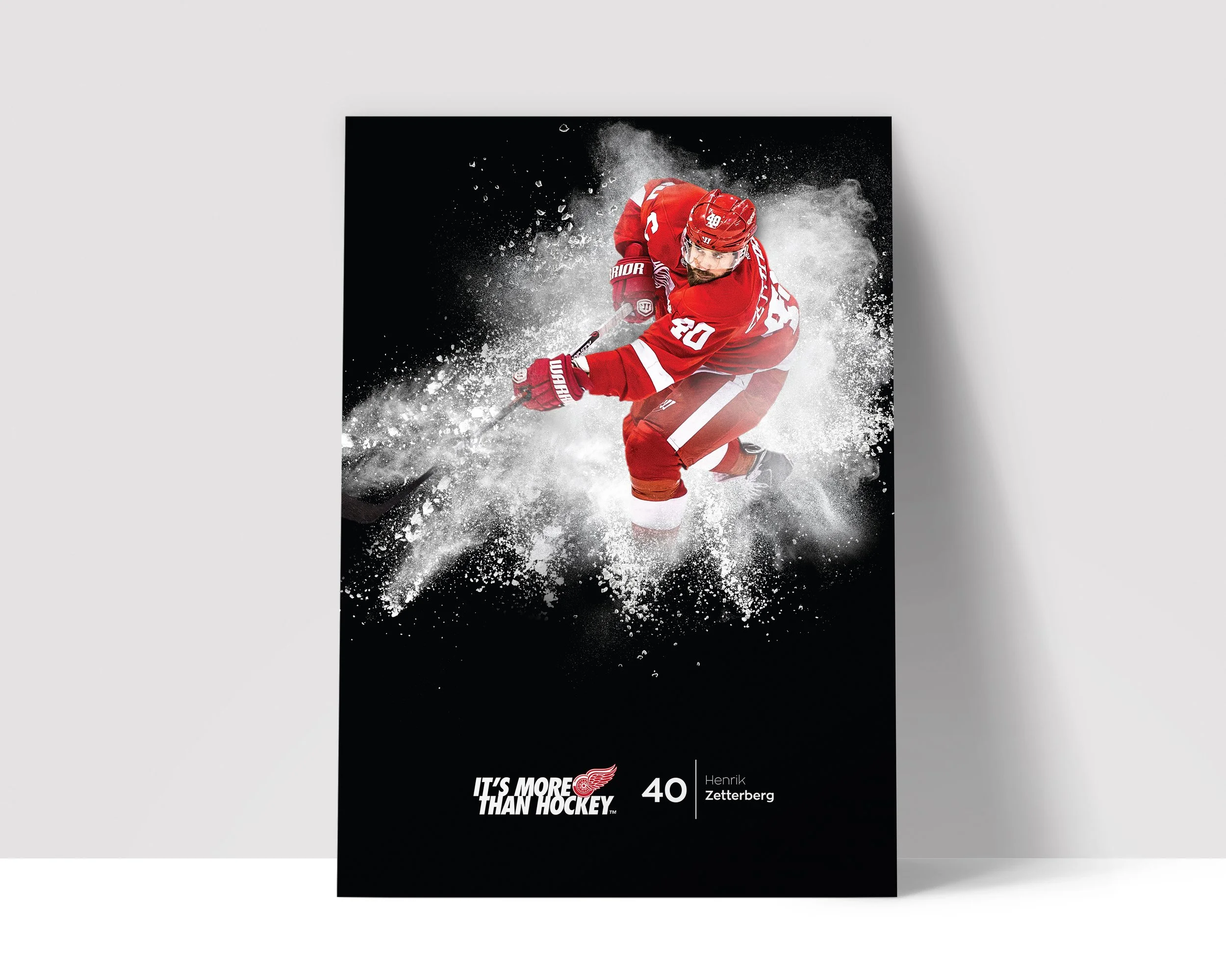
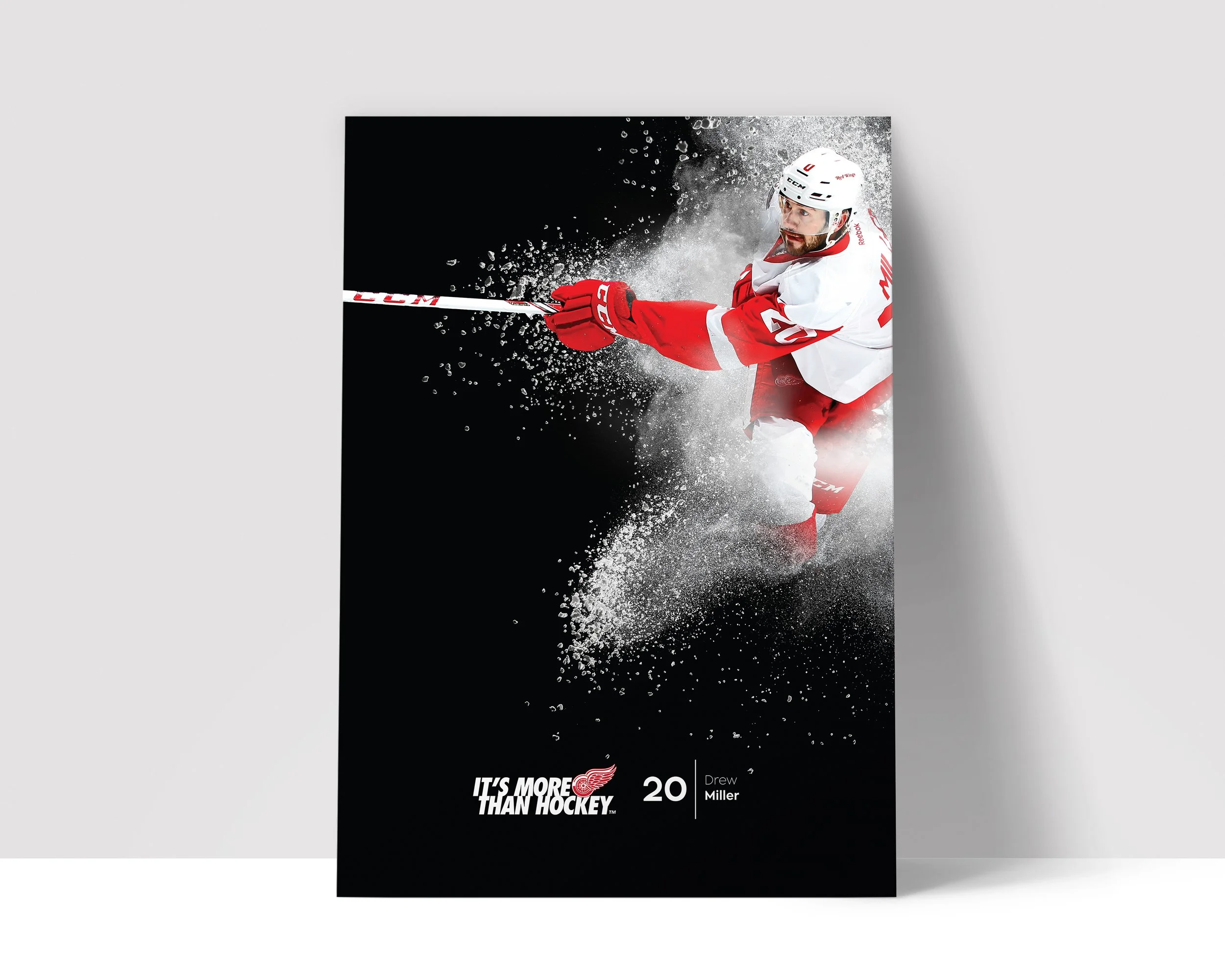
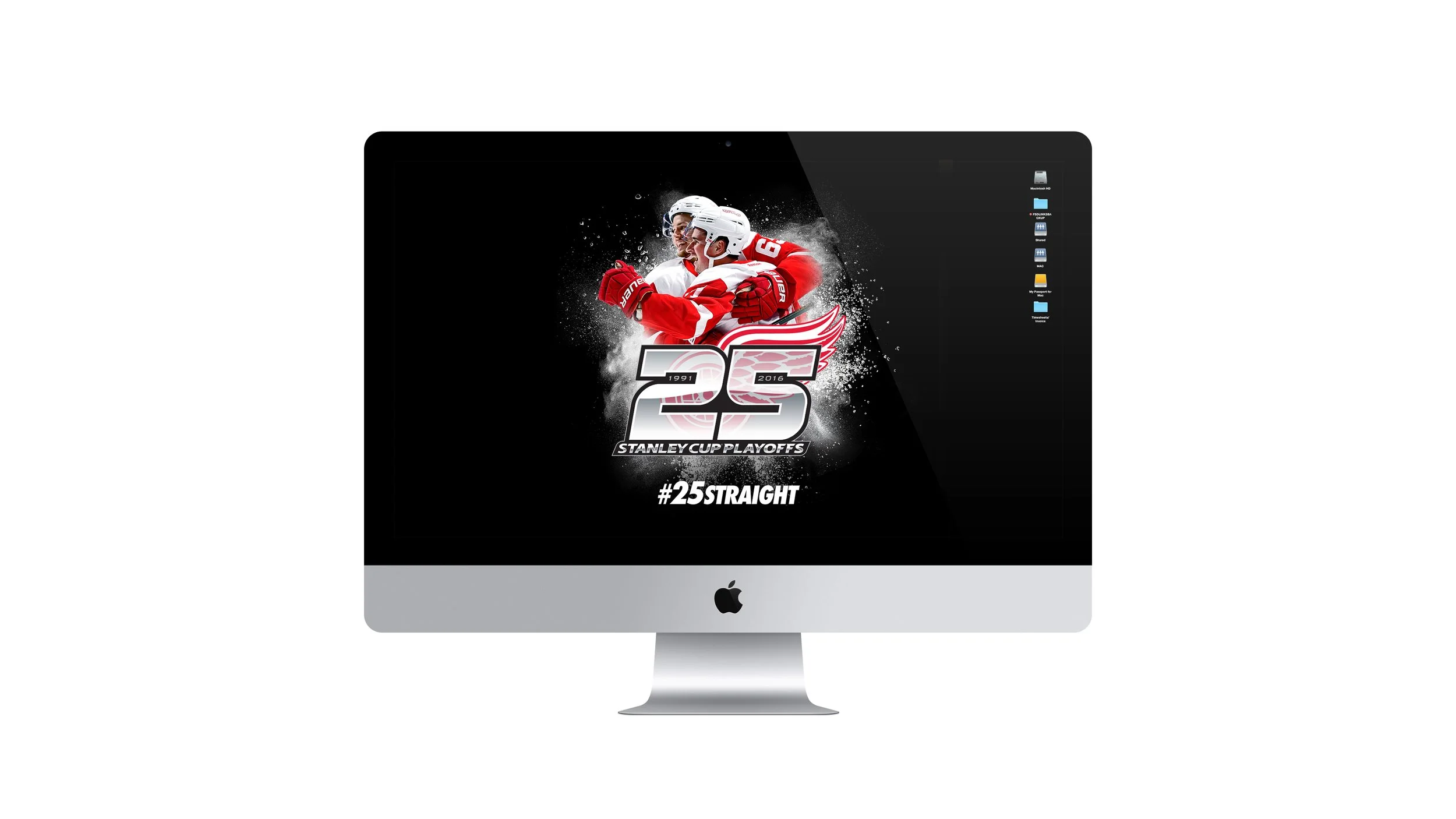
I worked with the Detroit Red Wings for several seasons and each year, we would develop a new look and feel. The Red Wings organization had been using “It’s More Than Hockey” as its tagline for several years and our goal was to revitalize and energize the campaign with new visuals. Without access to photograph the players, and a tight budget, I created this look and feel featuring the players front and center (from in-game photography) with a blend of ice and snow exploding around them. This campaign was very successful, so much so that the Detroit Red Wings organization chose to use it for multiple seasons afterwards. We then incorporated it into the "Farewell to the Joe" campaign for the team's final season at Joe Louis Arena. This project is very important to me as it was my first solo lead and marked a major success in my career.
-
Art Director, Designer
Farewell to the Joe
-
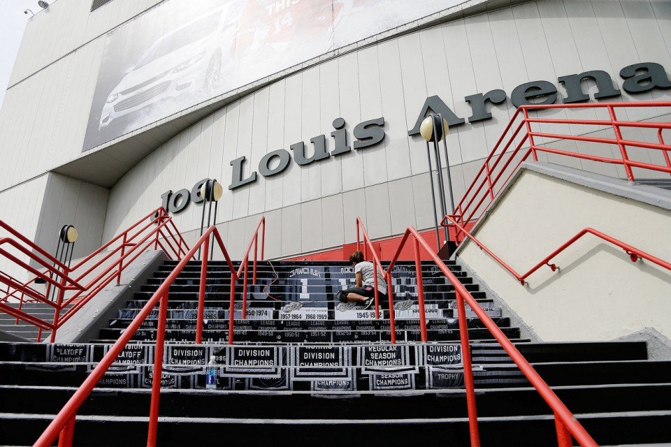
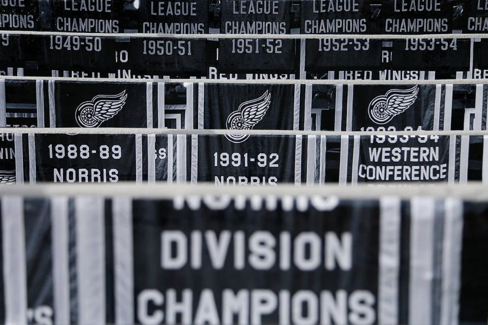
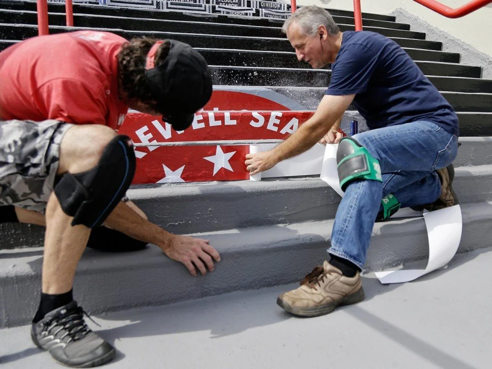
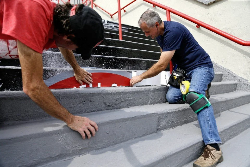
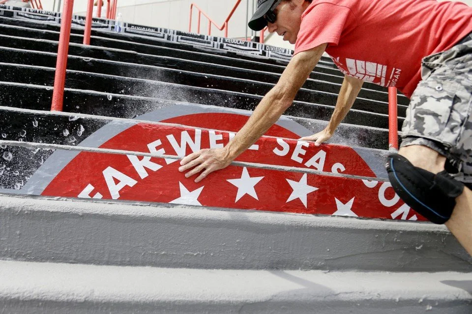
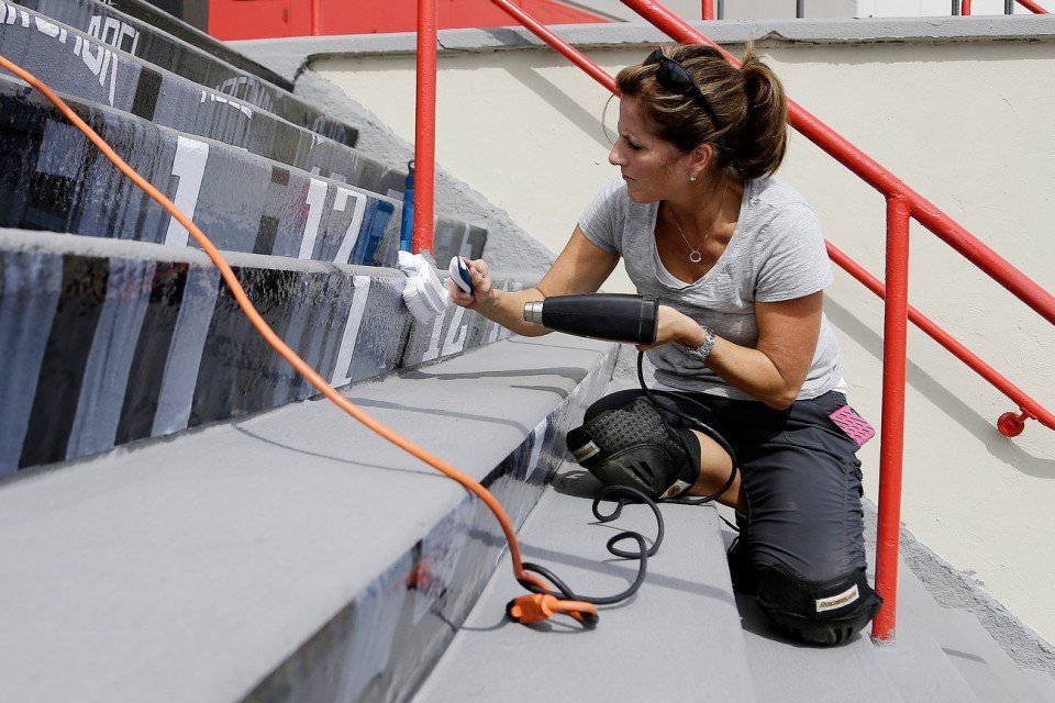
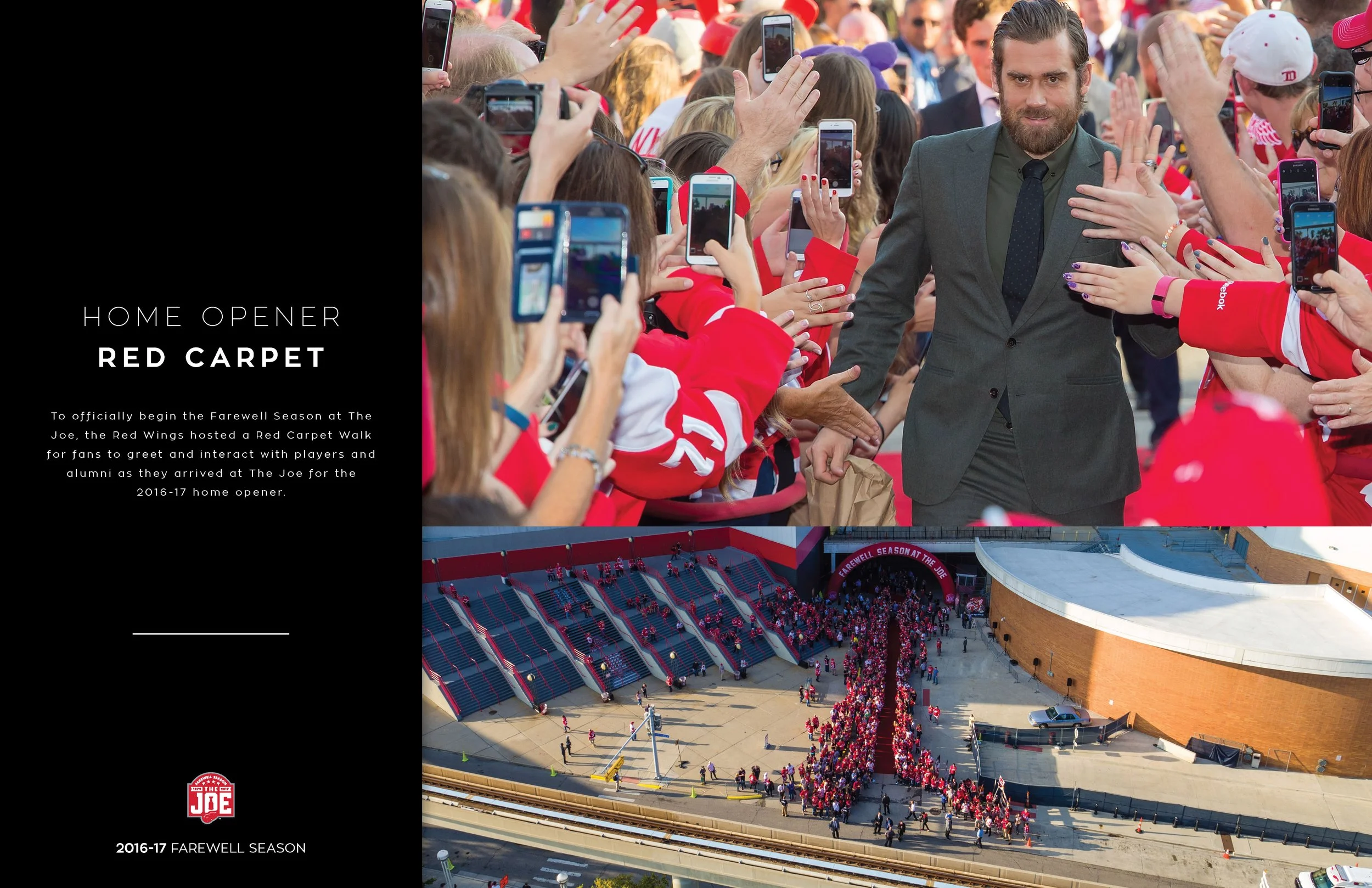
As the Red Wings organization prepared to move to their new arena, we centered our campaign on the final season inside the legendary Joe Louis Arena. We took design elements from the previous seasons and merged them with “Farewell to the Joe.” I created a fan favorite installation that showed the timeline of historic events taking place at Joe Louis Arena.
Additional assets and ‘Farewell to the Joe’ logo by Bryan Durren at the Detroit Red Wings -
Art Director, Designer

